Amitha's Blog
Bad Kitchen Layout | The Rookie Mistake That Could Ruin My Renovation | Amitha Verma
As far as bad kitchen layouts go, this is by far one of the worst ones I’ve ever seen.
I can tell that cooking in this kitchen would be very unpleasant. There is hardly any counter space. If I were cooking in this kitchen, I really wouldn’t be able to see what my family is up to.
As well, here’s nothing beautiful to look at with all of the obstructing walls in the way. Which, quite frankly, makes me feel like I am in kitchen prison.
What I want is a beautiful, spacious, functional kitchen.
I also want to feel as though I’m part of the flow of the home and wherever my family may be hanging out.
Simply put, I’m looking for a beautiful, spacious kitchen where we’re going to enjoy cooking and hanging out.
To get started on this renovation, I hired an architect to put this home onto a floor plan for me.
Today you’ll see:
- What makes this a bad kitchen layout
- The empty kitchen tour
- Kitchen measurements
- Home laundry room measurements
- The biggest bad kitchen layout dilemma
What makes this a bad kitchen layout
I have been super excited, brainstorming several different ideas on how to improve this kitchen. However, something isn’t matching up with the dimensions of the wall that the entire design is based upon. This is a huge red flag.
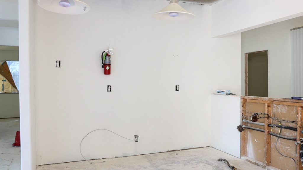
If I get this wrong, this entire project is going to be a huge and costly disaster. And I’m really under the gun to get this kitchen design done right.
Because my husband, Bobby Neal, wants to renovate this home next month. If I get this wrong, we would be back to square one, wasting precious time and money.
Apart from the timeline, I also wouldn’t be able to create the spacious kitchen that I’m dreaming for this house.
The empty kitchen tour
So let’s see what I’m working with on this bad kitchen layout!
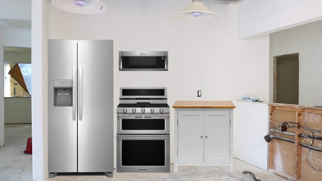
The refrigerator goes on the left most side. Then, right next to that is where the stove/oven unit went previously with a microwave up top. The little patch next to it was the only counter space in the entire kitchen.
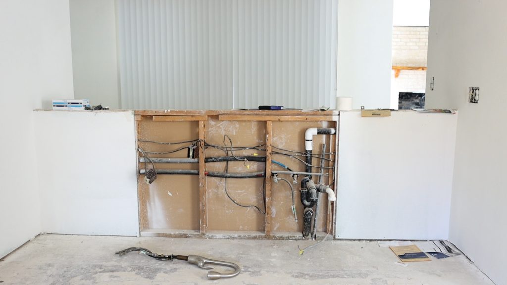
Along the half wall is where the sink, dishwasher, and one more appliance went.
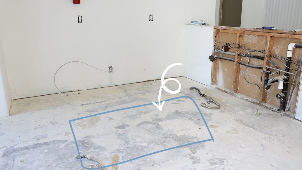
The previous owner also had an island in the center. I know this could be helpful, but it made this kitchen even more crowded and difficult to walk around.
As you can see, it’s already very cramped and hard for multiple people to work in. But we’re not done yet!

There is also a whole lot of wasted space just around the corner. I can’t even figure out what the homeowners were doing with it before. It’s a huge space and probably could house its own kitchen.
Yes, I can imagine there was probably a breakfast table over here. However, what’s going on with this empty space??
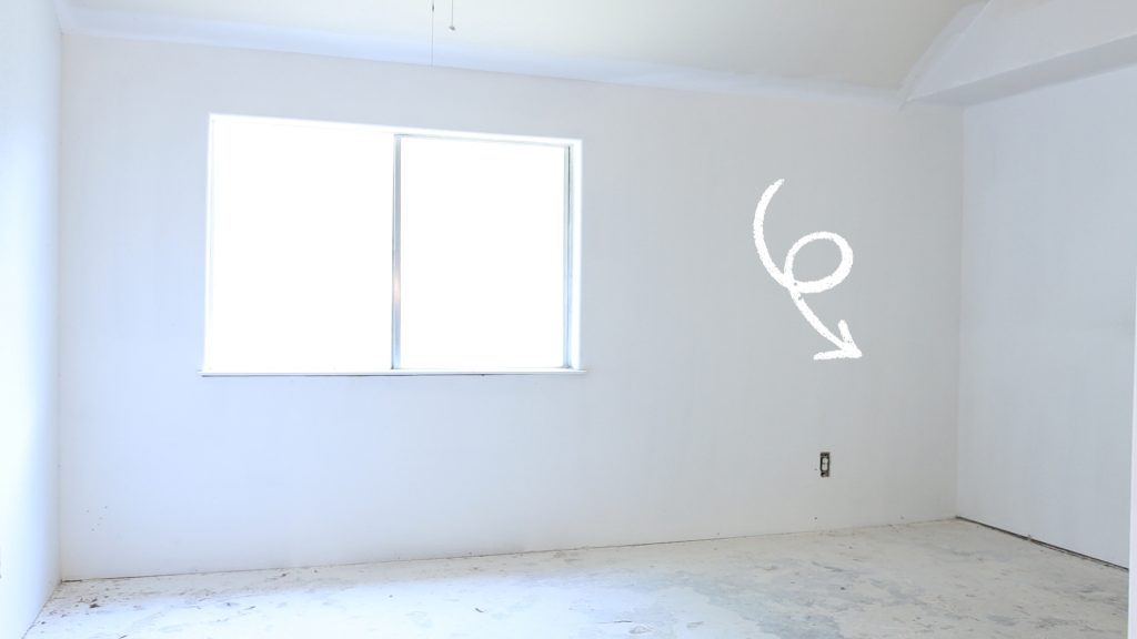
It makes no sense to me. Especially, since just on the other side of the kitchen wall is another dining space.

The cherry on top is, believe it or not, I think I am bigger than the pantry. I can imagine this pantry probably made the previous owner feel very angry and irritable. It’s just too tiny to fit food in unless you’re a pro at organizing your pantry.
Kitchen measurements
The big issue on this bad kitchen layout is the dimensions just aren’t matching up on the main kitchen wall.
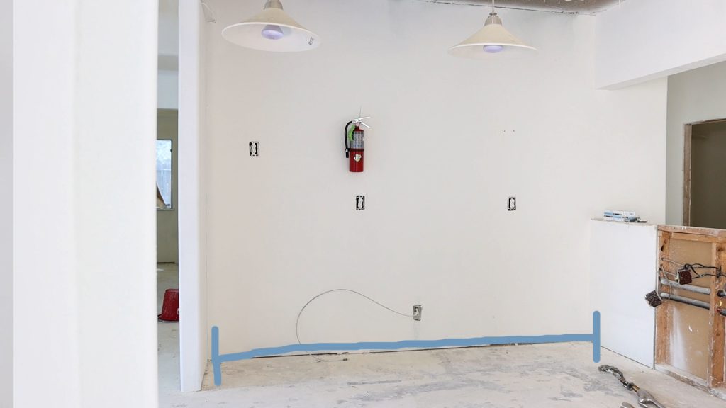
Here’s what I know for certain:
- The kitchen wall is on the back side of the laundry room.
- When I looked at my photos, the laundry room was only wide enough for the washer and dryer.

What I don’t know is where the architect came up with all of the extra space.
I took out my measuring tape to see where the dimensions are not lining up, and here’s what I came up with:
- Side wall of the kitchen = 5 inches wide and 2 feet, 2 inches long.
- Main wall = 10 feet, 3 inches
- Width of half wall = 4 inches
- Additional space opposite to half wall = 2 feet, 1 inch
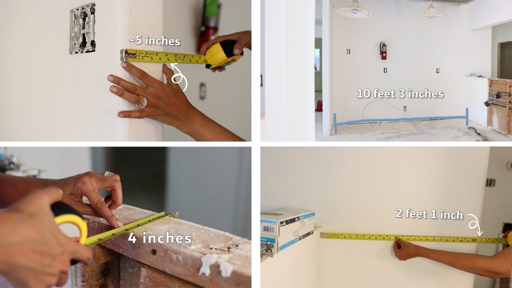
The kitchen I’ve been working on, it’s about 12 feet long for the back wall. So as you can see, the dimensions really don’t add up.
With the kitchen fully measured, I moved onto the flip side to check those dimensions.
Home laundry room measurements
Starting on the exact opposite wall of the bad kitchen layout, I measured the surrounding walls.

Here’s what I came up with on the dimensions:
- Side wall = 2 feet, 4 inches
- Laundry room = 5 feet, 1 inch
This is about what I thought by looking at the photos I had taken on my last job site visit. I think I know where the problem is, and this is actually another dilemma.
Just next to the laundry room is a large closet that was not marked on the floor plan.

I figured if I measured this, it would answer why the kitchen and the laundry room wall didn’t match up. Sure enough, we have about 5 feet, 7 inches.
The biggest bad kitchen layout dilemma
Here’s the thing, this space that was not marked is the only shared closet for the entire home.

So, for me to create the drain kitchen that we’ve been designing, we would probably have to delete this closet.
And I’m wondering, where would you put your coats, your shoes, your vacuum cleaners, your mops, your Christmas tree, even? I wonder, could we relocate these items to another spot or is this a must have?
Tell me in the comments: would you give up this storage to have a much bigger kitchen? Or would you rather have a smaller kitchen but have access to a great storage like this?
The good news is the dimensions were probably pretty spot on. The bad news is they didn’t include some of the key areas that are already a part of this home.
I’ve got my work cut out for me! Now on to figure out how to create my dream kitchen and maintain some of that storage.
Stay tuned and we’ll all find out!
Amitha
P.S. You can find all of these early fall decorating items at our retail store, Village Antiques in Houston.
Please stop by! Check out our collection of farmhouse-style furniture, French country home décor, antiques, vintage, chalk finish paints, and more.
We are open Tuesday – Saturday from 10:00 am to 5:00 pm.
You can also reach us at (713) 468 – 3931

Secret Tool Revealed
High-priced interior decorators desperately want this hidden: YOU can transform your home into a gorgeous dwelling—all by yourself—and save thousands. All you need is a few dollars’ worth of material. Access this amazing secret RIGHT NOW, and revitalize your home...in just a few hours.


