Amitha's Blog
Farmhouse Paint Colors | Avoid These Common Paint Mistakes | Amitha Verma
I’ve just finished a massive renovation to my shop in Houston. The most transformative tool that took my shop from tired and outdated to refreshed and modern was paint!
I love the power of paint so much that I’ve even created my own paint line!
Knowing how to use paint to transform a room is a home designer’s secret weapon because it’s so versatile and easy to use. Plus, it gives you massive payoffs in transforming a fixer-upper piece of furniture and your entire space.

I know that for a lot of you, choosing the right paint shade is the tricky part. That’s why I’m sharing my strategies for choosing the right farmhouse paint colors for your space and some habits to stay away from.
When you’re through reading this post, you’ll feel confident taking on any paint project in your home, big and small.
Let’s dive right in!
Tip #1: Consider The Color Scheme Of Your Decor
People often think that selecting the wall color is the first step to a perfect home makeover — but that is all wrong!
Whenever I’m working on my home, clients’ homes or even a shop renovation, choosing a paint color is the very last step.
Hear me out.
When designing my farmhouse style dining room, I knew I needed a wall color that matched the accented blue-gray painted finish on my dining chairs, the blue silk sheets, the gray tones in my dining table, and the gray tones on my stone floor.
These are the anchoring pieces of my dining room.
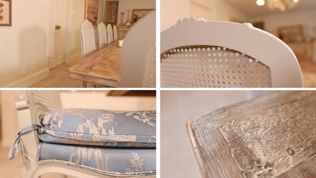
To make sure your paint color will work in your space, you need to consider the furniture and architectural design of the area you’re decorating.
Take a close look at all the accents and observe the commonalities.
If you’re struggling to find the commonalities, here are some things to look for in your furniture and accent pieces:
- Color tones in the paint or fabric (warm vs. cool; color families)
- Wood finishes (warm vs. cool)
- Metal fixture colors (silver, gold, bronze)
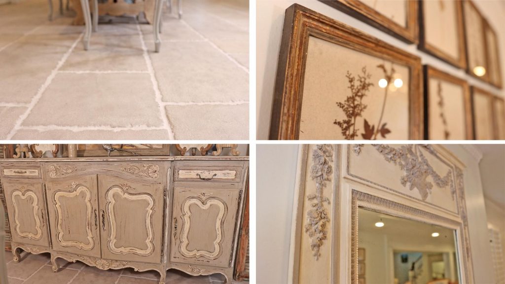
Because I’ve already defined the key pieces in my modern farmhouse dining room, rather than going the safe route with cream or white, I could go with a soft, blue-gray-green shade that would still compliment my existing palette or a revere pewter.
Tip #2: Stay On The Lighter Side
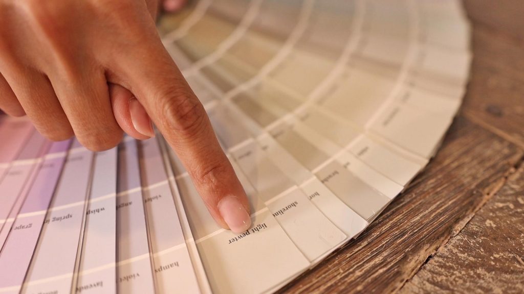
Paint strips start from light to dark, so I always stick to the first two or three shades on that strip and sample those on my walls.
Think of the paint color as secondary to the fabric colors, wood finishes, stonework, and your artwork. You don’t want the walls to be the loudest character in the room in the farmhouse style. That’s where your carefully curated decor comes in to tell the story.
This is why I prefer choosing colors in the top two or three groupings of a color chart. These softer shades are a more subtle and calming backdrop for the room I’m defining.
Now that you can recognize your room’s primary colors, it becomes a lot less intimidating to walk into a Benjamin Moore or Sherwin Williams.
Tip #3: Consider The Mood Of The Space
Color is a powerful design tool because it can significantly affect our mood and behavior.
Whenever I design a space, I always consider the feeling I’m trying to evoke. I’ve found that monochromatic color palettes (when the colors in the room and the wall belong to the same color family) create a calm and soothing environment and looks very chic and polished.
My farmhouse style kitchen is an excellent example of that. There’s plenty of natural light, and the kitchen cabinet, walls, and counter are all monochromatic.
If you want a room to feel relaxing, consider the colors we often see in nature (sky blue, soft greens, and browns).
This is the route I went with when I designed my mom’s room in my house — Yes, my mom has her own bedroom in my house.
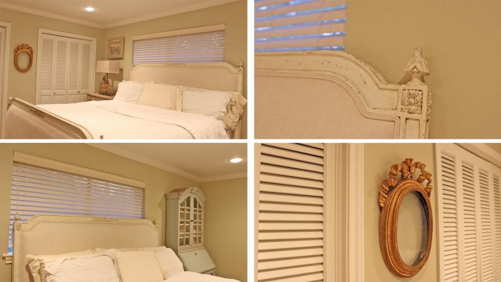
When my eldest son was born, he was a very sickly baby, so my mom came to stay with me to help with his care.
She joked that she would not wait for my slowness in selecting the perfect decor for her room and that it better be fit for a queen when she arrived. I knew she was joking, but I immediately painted her room light green to match the bluish-green furniture in the space, and it ticked off all the boxes — a space that was relaxing and elegant.
On the other end of the spectrum, if I wanted to create a room with more energy, I could have gone for high contrast with darker shades of green or blue.
Tip #4: Low Contrast Walls, Ceilings, and Trims
When it comes to painting my walls, ceiling, and trim, I always choose low-contrast colors.

Low-contrast means that if I paint my walls are gray, I will not paint the trim white. This creates a contrast that makes the walls seem shorter than they are.
The trim, ceiling, windows, and door tend to be a lighter shade of the main color I’m using. I do this because I want the furniture, antiques, rug, and artwork to be the star of the show. My walls can become the perfect backdrop for those things.
Tip #5: Choosing A Paint Finish
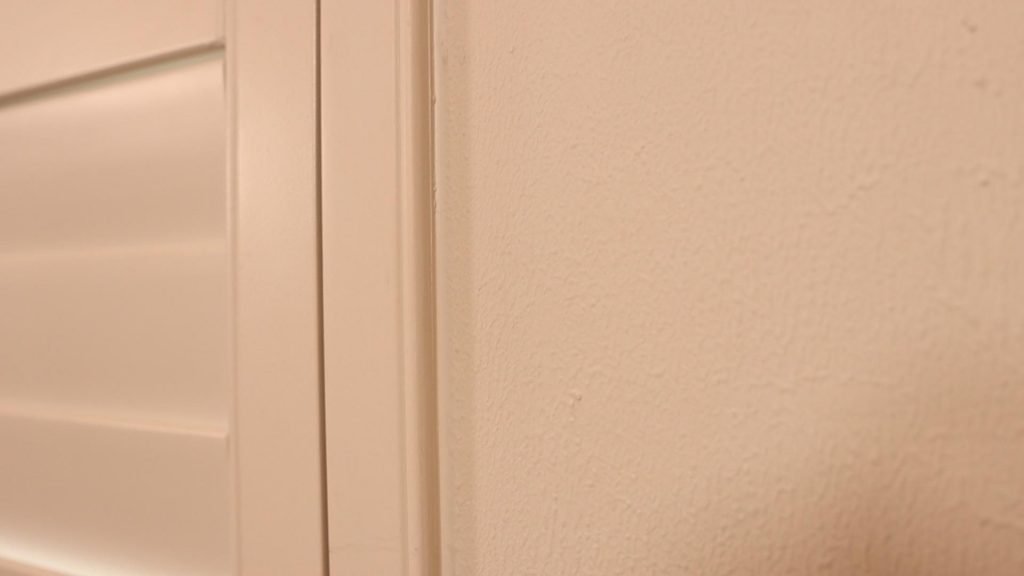
A common question I get asked is: “What level of sheen should go on the walls?”
For this, I take into account the design style we’re working with.
Since we’re working with modern farmhouse, many of the furniture finishes tend to be textured and weathered, so I’ll stick with a flat or a satin finish — nothing shinier than that!
Tip #6: Avoid Pure White

This principle applies to your walls and trim paint — avoid pure white.
You may feel tempted to go with the brightest white at your local paint stores, but do yourself a favor and stay away from that section.
I’m not against white, but sometimes it can feel a bit cold and impersonal. And it’s a lot more challenging to work with than just choosing a color.
Here’s why…
Colors are relative, which basically means their shades can shift depending on their surrounding colors.
Unless your white paint is completely free of pigment, it will have an undertone of color, which is why you’ll find many, many shades of white at your paint shop.
If you want to paint white, look for one with an undertone that pulls from your room’s common colors so it still feels cohesive. For example, if your wood tones are warm, look for a warm white rather than a cool white. Otherwise, you could end up with a white shade that clashes with the furniture in your room.
Tip #7: Stay Away From Paint Fads
Painting your walls is a big commitment, so you want to feel confident about your color choice because you’re likely not going to change it for a while.
This is the reason I stay away from paint trends like sparkle or accent walls.
I know this is a hot-button topic, but if you love a color enough to make an accent wall, go all out! Be decisive in your color choices.
Don’t be afraid to go all-out on your paint colors, especially in your powder room, bedroom, dining room, or home office, where you can surround yourself with the colors you love.
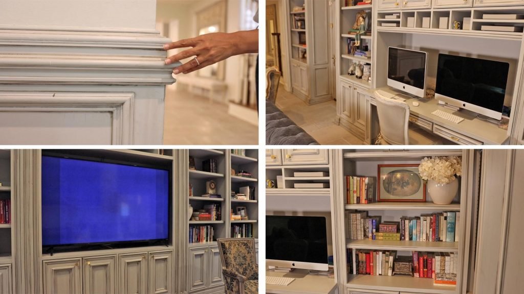
I did this in my family media room, where we spend most of our time. This space houses mine and my hubby’s built-in work from home desks, three walls of bookshelves, our television, and our coziest couches.
Because we enjoy spending time together as a family in this room, rather than paint the walls white or creating an accent wall, I decided to paint the shelves and the walls a beautiful blue shade that pulls from the room’s fabrics and evokes a sense of serenity and calm.
The Takeaway: How To Choose Farmhouse Paint Colors
If after reading these tips, you still have no idea where to start, I created a free downloadable worksheet with some of my favorite, tried-and-true paint colors to shortcut your way to making over your walls today.
You can download it right here.
Leave a comment and let me know if you’ll be using these tips in your home. Of course, if you have any questions, let me know as well!
If you see some decor you love in this week’s blog post, you can find most of them at Village Antiques in Houston, Texas. We’re open Tuesday to Saturday from 10 am – 5 pm, so stop on by! Or you can feel free to call us at 713-468-3931 if you have any questions.
Stay up to date with my design tips by signing up for my free newsletter at this page’s top right.
Until the next time we meet, keep making your home amazing with your design gifts!

Secret Tool Revealed
High-priced interior decorators desperately want this hidden: YOU can transform your home into a gorgeous dwelling—all by yourself—and save thousands. All you need is a few dollars’ worth of material. Access this amazing secret RIGHT NOW, and revitalize your home...in just a few hours.


