Amitha's Blog
Farmhouse Style Renovation | How To Begin a Small Apartment Makeover and Save Money | Amitha Verma
We have officially decided on the final design for this farmhouse style renovation of an apartment complex in Houston, TX!
I know this must seem like it took us forever to even land on a concept. However, this has saved us *tens of thousands of dollars* in design mistakes.
Since many of you love to update your spaces but do not want to do a full demo, I am sharing how to begin a small apartment (or any home) makeover AND save money at the same time!
A couple of weeks ago, I shared this project with you in its very beginning stages. We were initially working with the grayscale concept that my husband, Bobby Neal was leaning towards. Through testing, we found that it was not the right fit for this property.
This week, I show you the two concepts we boiled it down to and I reveal the one we chose!
What to expect in this blog:
- Initial apartment renderings
- Warm toned apartment renderings
- Cool toned apartment renderings
- Money saving renovation tip
- The winning farmhouse style renovation concept
- Farmhouse style renovation *freebie!*
Initial apartment renderings
We began this farmhouse style renovation at a little bit of a crossroads. My husband, who is managing the project, wanted to go deep down the gray scale. He was drawn towards an ultra modern vibe, but it just didn’t seem like the right fit for the project.

This interior color scheme would not be the right fit because it looked nothing like the exterior.

On the outside, there are beautiful golden and cream hues and an overall traditional farmhouse style bricks and stonework. Taking that into consideration, this property doesn’t read as modern, sleek, or grayscale minimalist like Bobby Neal was going for.
I could hear his desires, so I worked with my rendering expert to design two real-life concepts to choose from. One fit the style of the property and the other incorporated the gray scale.
Warm toned apartment renderings
For the first farmhouse style renovation concept, I took inspiration from the exterior to start honing down on the finishes. This one is very in line with the exterior stonework and paint colors.
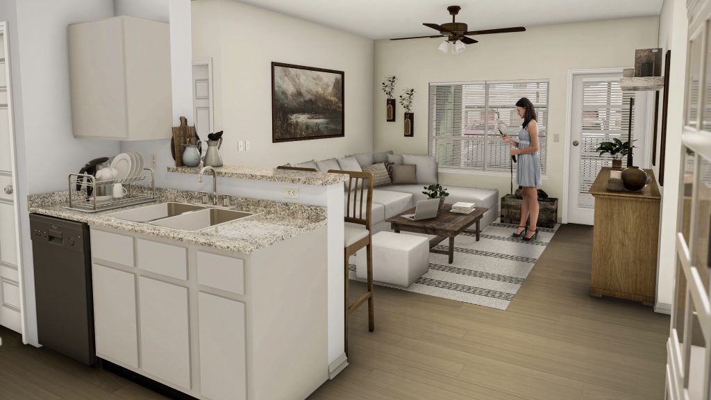
We broke down this design into three categories to land on the final rendering:
- Flooring/ tiles
- Countertops
- Paint color
On the floor we went with light honey colored wood style tiles with just a touch of gray.

This would be the grounding factor for the design in the units. Because the floor is such a large surface area, I knew this would be great to determine the color palette.
My next recommendation was to look for a countertop. We opted for a style with lighter hues to step away from the dark tones currently in the property. We also kept in mind how they would look next to the tile that we chose.
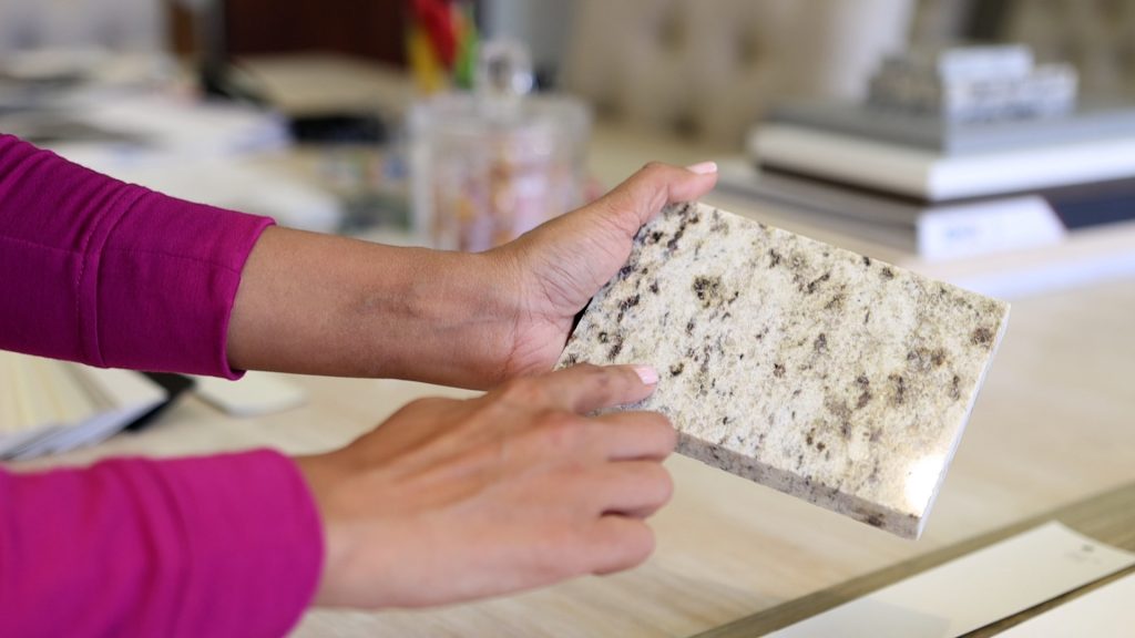
I decided on a creamy stone with hints of brown and gray to tie the exterior and the interior colors.
From here, I was able to come up with paint options that I want to see in the unit. These will go on the kitchen cabinets, walls, doors and trim.
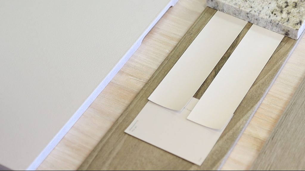
Cool toned apartment renderings
This farmhouse style renovation concept was driven by Neal’s desire to see a little bit of gray in the interiors.
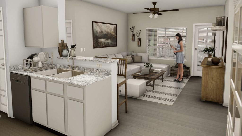
We also broke down this design into three categories:
- Flooring/ tiles
- Countertops
- Paint color

I started with wooden tile floors similar to option number one, but with more gray hues.
Next, that allowed me to pull a primarily white countertop with gray and dark specks all throughout.

Similar to the warm toned concept, I opted for neutral paint colors for the kitchen cabinets and the walls. These are just the cool toned versions.

As you can see, there’s nothing more transformative than paint. That’s why I love it, crafted my own, and I put my name on it.
I know it can be scary to repaint your whole home, but it is the best bang for your buck.
Money saving renovation tip
This is such a large scale and risky design project that we decided to do something different.
I had Neal’s team reach out to some of their clients, customers, and tenants to do a poll. This was to see which ones they preferred, since they are actually going to be living in this space.
Keep reading to find out which one his clients opted for!
As we were collecting our farmhouse style renovation elements, I was able to visualize how it was going to turn out, but my husband was not.
For that reason, we started putting these finishes together into a 3-D visual presentation.
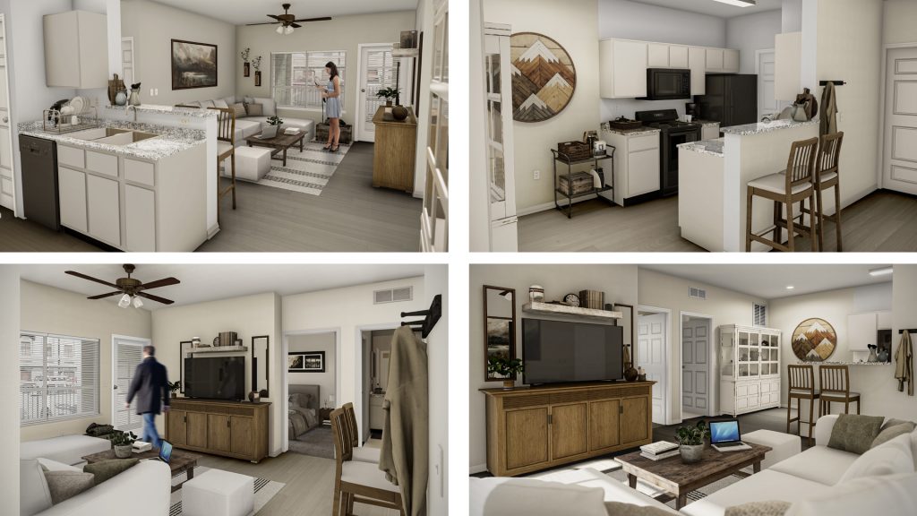
By doing this process, we were able to see:
- How they would look/ which one we preferred overall
- The cost/ price difference
This saved us tens of thousands of dollars in design regrets. Meaning, when you put something in and you say “Oh no, that’s not how I envisioned it!”
I really want you to take away from this episode that this is not a huge renovation. We did simple updates by updating the flooring, changing the paint color and swapping out the countertops.
Just these three swaps alone will make the property feel brand new, warm, and welcoming.
Okay… so I kept you waiting long enough.
Which one did they choose?
The winning Farmhouse style renovation concept is…
Neal’s tenants and customers chose the warm toned concept.

His ideal client is drawn to the colors of the buildings. They love the outdoor stonework and the paint colors, and want to see more of that on the inside.
Farmhouse style renovation *freebie!*
If you like these concepts, here’s a downloadable workbook of all the materials, paint colors, product names, and where to buy them.
These are colors that I use on multi-million dollar home renovations, apartment projects and also throughout my shop.
I promise you, you’re going to love looking at these colors for your own house.
If you’re not already signed up for my newsletter, please do so at the top of this page. Just fill out your name and email and then you will receive weekly FREE design advice straight to your inbox.
I really hope you enjoyed watching this process and coming along this design journey. If you did, you are in for a treat because we have renovation projects slated for this year and next.
Keep using your amazing design gifts to create heart in your home,
Amitha
P.S. You can find all of these early fall decorating items at our retail store, Village Antiques in Houston.
Please stop by to see our farmhouse-style furniture, French country home decor, antiques, vintage, chalk finish paints, and more!
We are open Tuesday – Saturday from 10:00 am to 5:00 pm.
You can also reach us at (713) 468 – 3931

Secret Tool Revealed
High-priced interior decorators desperately want this hidden: YOU can transform your home into a gorgeous dwelling—all by yourself—and save thousands. All you need is a few dollars’ worth of material. Access this amazing secret RIGHT NOW, and revitalize your home...in just a few hours.


