Amitha's Blog
Modern Farmhouse | How To Avoid Problems When Starting A Small Apartment Renovation | Amitha Verma
My first interior design project for 2022 has begun! It is a renovation of a small apartment complex – in the modern farmhouse style.
This is going to be a very challenging makeover. I am working with a tight budget, designing for tenants who I’ll never meet, and teaming up with my hubby, Bobby Neal.
Neal recruited me as the designer-eye to give this complex a much needed update that functions well and looks beautiful.
However, we haven’t even put a dent in this project and we’ve already come across problems; we do not agree on the colors that should be in these units.
He is really excited about a specific color palette to give the apartments a fresh, modern feel.
Just on gut instinct alone, I don’t think this is the right solution for this property in particular.
Instead, I’m creating an in-depth style guide to freshen up these apartments in a way that is consistent from unit to unit.
But before I share that with you, let’s walk through some of his ideas and see how it looks.
Empty apartment tour
Currently, the interior of these apartment units have “modern farmhouse” written nowhere on them.

Typically when Neal works on a renovation, it tends to be one unit at a time. That means when they need to replace flooring, countertops or faucets, they just get whatever is available.
Over time, that has made the units feel like a collection of hodgepodge ideas that don’t really go well together.
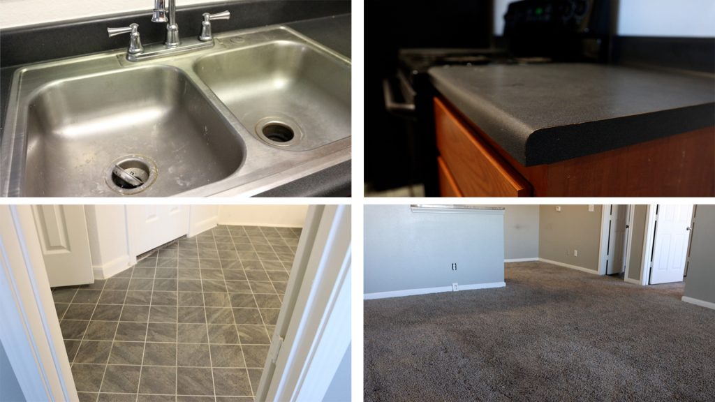
To start, we are first taking into consideration the large surface area – that being the floors.
Those areas will influence the color palette, style, look and feel.
Picking the modern farmhouse color palette
To create the modern farmhouse look, we want to create the same style of flooring throughout all of the units.
This is the area where Neal got super excited about adding in a gray color palette…

I guess he didn’t watch my video about the 2022 year trends! Gray is a great color, but it may be a bit difficult to work with as people’s styles are changing.
He is especially in love with the look of gray tile flooring that mimics the texture of wood. If we went with these tiles, they’d be what we build the design around.
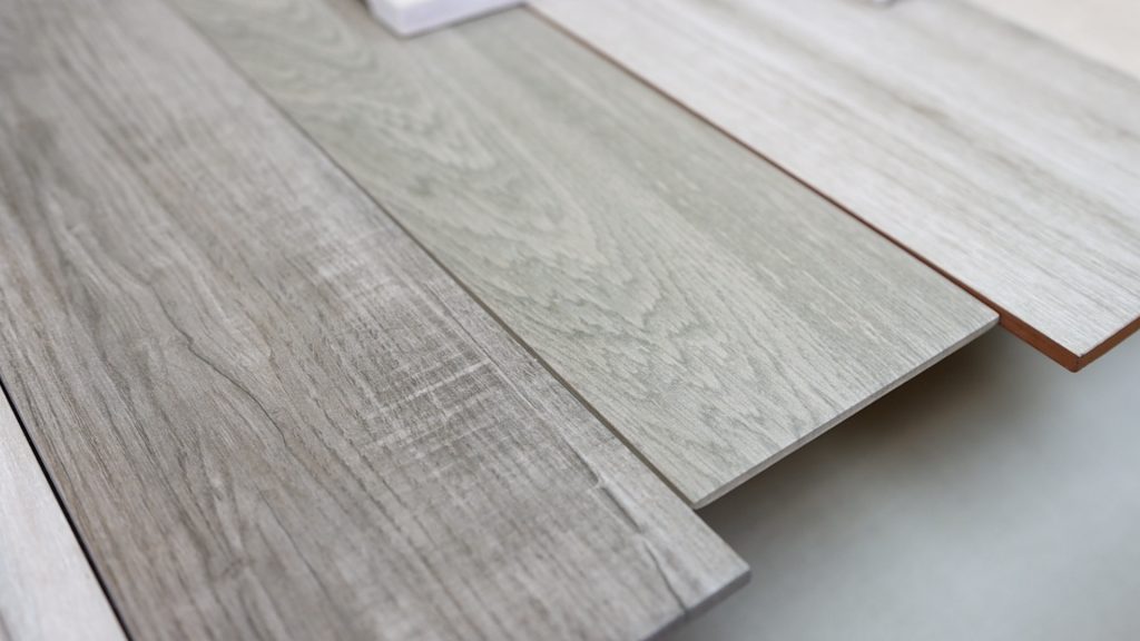
I entertained the idea of going this route on the flooring. Then I worked with Neal to select the countertops and cabinet doors to match.
I took a cabinet door from one of the units and painted it to match the color palette. This was to get an idea of how the gray scheme would actually look.

At the same time we experimented with countertop and tile materials to go with this design. These would go on the backsplash or on the bathroom floor.
Even before running through this test with Neal, I knew this was not the right color palette. However, I always say you can catch more flies with honey, and that’s exactly what I did.
Modern apartment rendering
We wanted to achieve a modern farmhouse look, but this gray color palette was coming off too cold, and not cozy.
My rendering expert created an example to show Neal what this concept would look like.
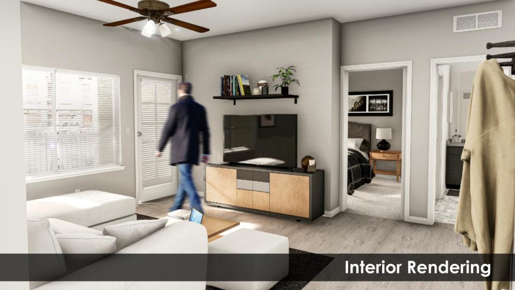
In doing this, it showed him how his idea is a bit too modern. We also need to consider how the interior relates to the exterior of the complex.
When you come onto the property, you won’t believe it, but this is a gorgeous provincial farmhouse style apartment complex! It has beautiful gold and cream, warm toned stone work and paint all throughout the property.
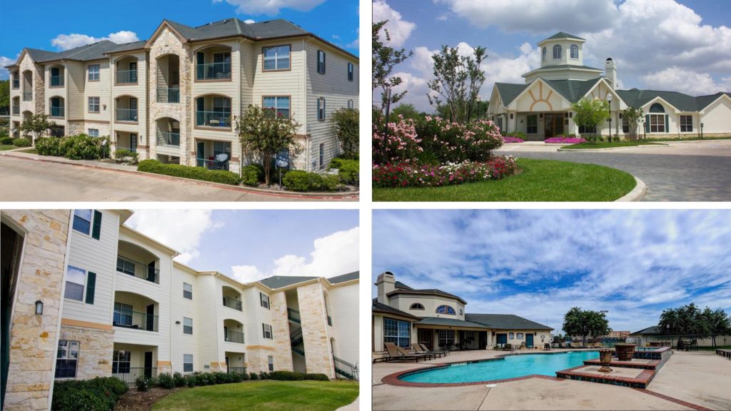
With that in mind, the gray interior would contrast between the exterior, and would not make sense.
Instead of gray, I would expect to see creams, browns, golden tones, and even a little blue on the inside.
But I’m not quite sure yet, and that’s exactly where I am on this project.
I’m glad we went through this exercise. It would have been a yearlong project and a very expensive undertaking to do the wrong design concept.
The rendering showed Neal that his idea was beautiful, but it’s not the right direction for this property.
Modern farmhouse plans
So where do we go from here with our modern farmhouse plans? Well, back to the drawing board.
The good thing is we’ve already done this exercise once, so it’s always easier the next time around.
As I mentioned, the large surface areas are really going to dictate the style and the vibe.

We will come at this project in this order:
- Select the flooring
- Choosing countertops
- Cabinets
- Wall paint
Paint, of course, is a huge factor, but I always save for the very end of my project. I know oftentimes people think paint is the first thing that we choose, but it’s actually the last.
If you want to know why and how I do that, I have a tutorial on this exact topic that you can follow.
What color palette would you choose?
I’m going to share the next concepts with you in just a few weeks. In the meantime I would love to hear from you!
Are you with Neal with the modern gray vibe? Or are you on my side with the cream colored farmhouse feel?

You can leave a comment now or stay tuned for the next episode! I’m going to be sharing with you the next concept that we’re going to try to bring these two together.
Don’t forget to sign up for your free newsletter to get notifications every time a new blog comes out and exclusive inventory alerts and design advice.
Keep using your amazing design gifts to create heart in your home,
Amitha
P.S. You can find all of these early fall decorating items at our retail store, Village Antiques in Houston.
Please stop by and check out our collection of farmhouse-style furniture, french country home decor, antiques, vintage, chalk finish paints, and more!
We are open Tuesday – Saturday from 10:00 am to 5:00 pm.
You can also reach us at (713) 468 – 3931

Secret Tool Revealed
High-priced interior decorators desperately want this hidden: YOU can transform your home into a gorgeous dwelling—all by yourself—and save thousands. All you need is a few dollars’ worth of material. Access this amazing secret RIGHT NOW, and revitalize your home...in just a few hours.


