Amitha's Blog
Open Concept Floor Plans | Which of These Kitchen Layouts Would You Choose?
Are open concept floor plans falling out of fashion due to us needing separate spaces for work and living?
Open concept designs aren’t going anywhere. Open concept floor plans give your home that much needed connection between you and your loved ones. These layouts give you visibility and flexibility to change up your design to match the way you live and entertain in your homes.
But how much is too much or even too little?
I bring this up because I’m about to begin a huge home renovation project. I need to decide on the kitchen floor plan before starting the demo, installation, and final farmhouse and french country touches. I always start with the kitchen because it drastically impacts the entire flow of the house — this is where I could use your help.
I’m torn between two floor plans.
One is called “Kitchen in the Middle” (Option A) and “Kitchen on the Garage” (Option B) — both have their pros and cons, so I need your help to watch to the end of this week’s video and leave a comment on your vote for your preferred option.
Which plan would you choose?
The Home Specs
This home was built in the 70s, and while it has a lot of character and charm, it comes with quirks that will cost a pretty penny to fix.
I’ll be working with my team to add some modern finishes to create a house plan design that’s practical and efficient.
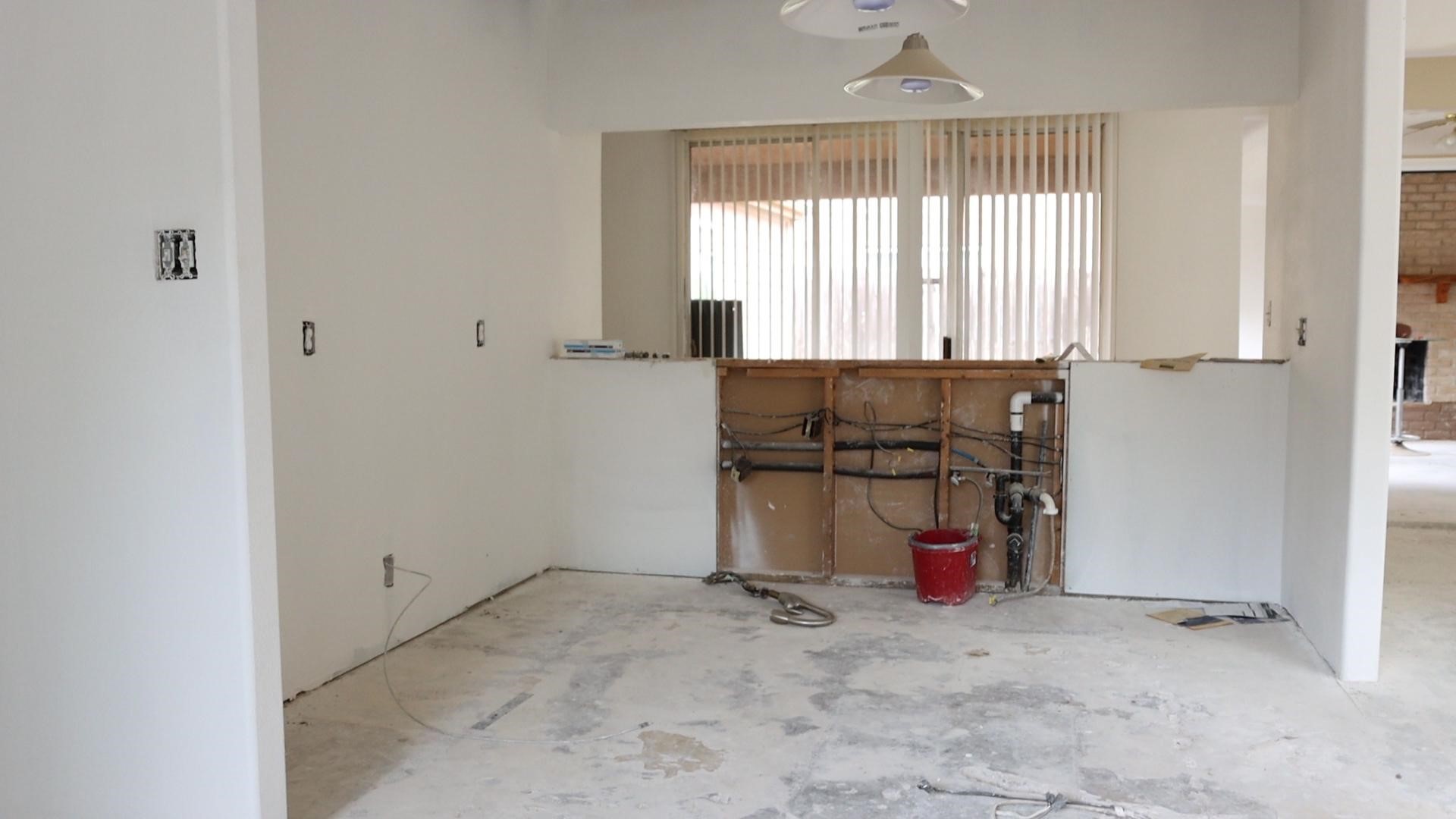
The Biggest Issues:
- Size: The kitchen is very small. The square footage restriction forces all the appliances to be right on top of each other and doesn’t allow for more than one person to cook at a time.
- Functionality: When people sit at the bar, they will be looking into the kitchen instead of the beautiful courtyard on the other side.
- Lack Of Openness: The kitchen is a section of the house where you don’t have a clear eye line to the family room.
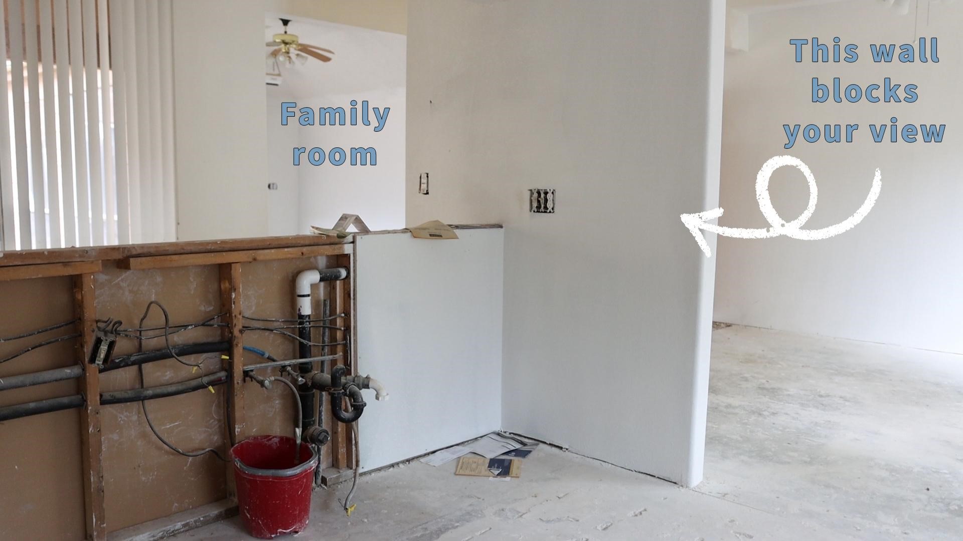
As a mom of two boys, a dog-mom to Coco, and someone who loves to host, I want to be in the kitchen cooking while entertaining guests or keeping an eye on my loved ones in the dining and living areas.
Although this house isn’t for me, I decided to create a new floor plan to fix some of these issues in the dining and living areas for the next homeowner, and transform this space into a dream home.
Here’s What I’m Thinking:
We have two different options.
- Kitchen In The Middle (Option A)
- Kitchen On The Garage (Option B)
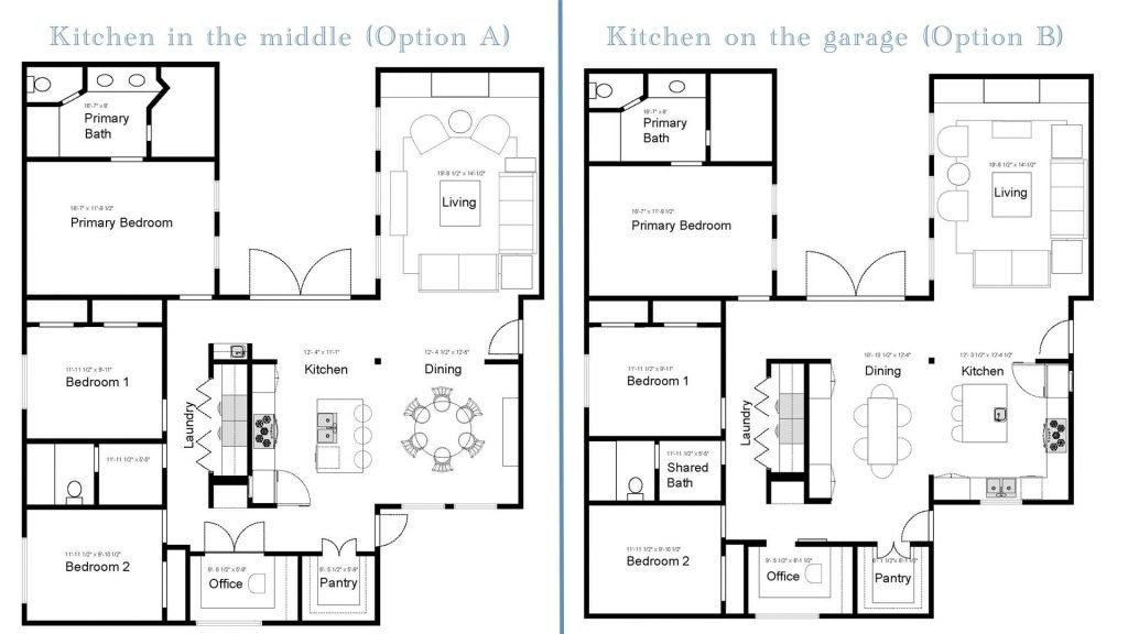
Option A: Kitchen In The Middle
This house originally has a kitchen in the middle, and since we don’t know what the renovations will cost us, it might be economical to keep the kitchen in the middle of the floorplan.
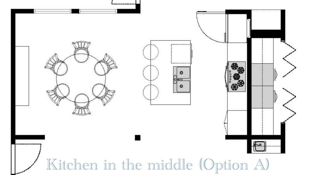
We’ve removed the bar wall and the wall between the kitchen and dining room in this floor plan. We did this to open up the space, but it also gives us room to create a long bank of cabinets at the back of the kitchen and create a center island that didn’t exist before.
Just by removing those extra walls, the kitchen now naturally flows into the dining room. Originally, this house had two eating areas, but we decided to consolidate them into one space near the entrance since this house is small.
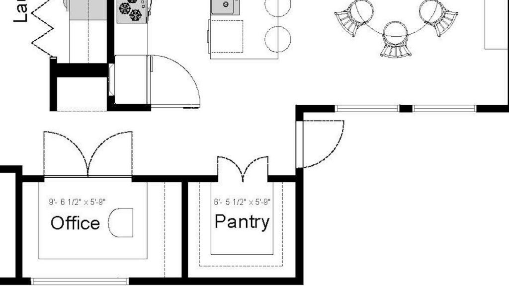
This design allows the original breakfast nook to become a walk-in pantry or an office.
Option A Pros:
- Cost-Effective
- Consolidates the dining room and breakfast nook to open up areas
- It creates space for a perimeter wall of cabinets
- Space for a center island
- Allows for a view into the dining room and courtyard
Option B Con:
- Lacks direct eye-line into the family room
Before you fall in love with this option and say, “this is it!” I want you to consider Option B, “Kitchen On The Garage.”
Option B: Kitchen On The Garage
This floor plan is a little unconventional, but we flipped the kitchen and the dining room.
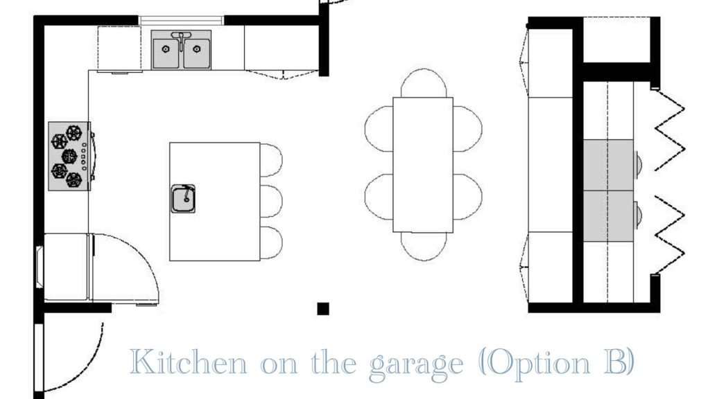
When I was looking at the dining room, I thought about the two long walls and how they could house a lot of cabinetry and create a beautiful focal wall at the same time.
Flipping the dining room allows for that same idea of consolidating the breakfast and dining room into one space and allowing the dining room to view the courtyard.
Option B Pros:
- Direct access to the living room
- Direct access to the dining room
- The dining room has space for a 6-foot-long table
- While sitting down for a meal, you have a peaceful view of the courtyard
Option B Con:
- The kitchen is at the front of the house
When you walk in through the entrance, there will be a wall before seeing the kitchen immediately.

This option might not be a practical layout for the homeowner who is messy and often leaves dishes in the sink — but if you’re anything like my family and me, we tend to congregate around the kitchen, and I’d love for that to overflow into the family room and dining room.
Help Me Decide
As you can see, there are pros and cons to both plans. We usually rely on the budget to eliminate one option over the other—but in this case, we estimate that it will be very similar, whichever way we go.
That’s why it’s such a dilemma!
I’d love to hear your thoughts on which open-plan kitchen concept you prefer.
If it helps to make a decision, you can think of it this way:
- Which option makes the most sense for how you and your family live?
- Do you think having a kitchen at the entrance is a design faux-pas? (remember, sometimes rules can be broken when done right)
Leave your thoughts in the comments section below!
You don’t have to be a professional designer to have an option. We all know what feels like home to us, and that is exactly what I want to hear from you this week.
Here’s What’s Coming Up…
I have a home renovation coming soon!
Later this year, I’ll be sharing the entire floor plan, all the finishes, colors, fabric, furniture, wallpaper, and the before-and-after of this home renovation.
As always, if you’re not already signed up to receive your free design newsletter and you want to be the first to know about sneak peeks like this, don’t forget to type your first name and email into the top of this page to sign up for updates and designer insights automatically.
P.S. I have another sneak peek for you. We have new arrivals at the shop this week, so grab them before they’re gone! Village Antiques in Houston, TX is open Tuesday – Saturday, 10:00 am – 5:00 pm, so stop on by! Or feel free to give us a call at 713-468-3931 if you have any questions.

Inspiring you to create heart in your home,
Amitha

Secret Tool Revealed
High-priced interior decorators desperately want this hidden: YOU can transform your home into a gorgeous dwelling—all by yourself—and save thousands. All you need is a few dollars’ worth of material. Access this amazing secret RIGHT NOW, and revitalize your home...in just a few hours.


